Design System
A modular design system for modern web interfaces.
Light
Dark
A modular design system for modern web interfaces.
Access the map with location by IP (default) and GPS. Enter your name to get started.
Open Map AppInclude the CSS in your project:
<link rel="stylesheet" href="https://cdn.jsdelivr.net/gh/noway0w/Design-System-OSiris@main/osiris.css" />Note: For production, consider using a CDN like jsDelivr or GitHub Pages once deployed.
<button class="btn-primary">Solid Button</button>
<button class="btn-primary gradient">Gradient Button</button>
The animated toggle requires specific HTML structure and dependency on core-actions.css.
<div class="checkbox-wrapper-44">
  <label class="toggleButton">
    <input type="checkbox">
    <div>
      <svg viewBox="1 4 37 37">
        <path d="M14,24 L21,31 L39.7428882,11.5937758 C35.2809627,6.53125861 30.0333333,4 24,4 C12.95,4 4,12.95 4,24 C4,35.05 12.95,44 24,44 C35.05,44 44,35.05 44,24 C44,19.3 42.5809627,15.1645919 39.7428882,11.5937758" transform="translate(-2.000000, -2.000000)"></path>
      </svg>
    </div>
  </label>
</div>
 -4,8°C
 77 %
77 %
AAPL
$150.00
The dashboard tiles are modular components designed for various content types.
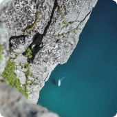
Use for immersive content like "Memory of the Day". The image acts as a full-bleed background.
<div class="content-tile">
  <img src="path/to/image.png" class="content-tile-img" alt="Description">
  <div class="content-tile-overlay">
    <div class="content-tile-title">Title Here</div>
  </div>
</div>
Designed for user status. Set the background image via inline styles or a custom class.
<div class="user-profile-tile" style="background-image: url('path/to/bg.png');">
  <div class="user-status-header">
    <span class="user-status-text">User detected</span>
    <div class="user-status-dot"></div>
  </div>
  <div class="user-name">Edouard</div>
</div>
Usage: <img src="weather_icons/icon_name.svg" class="weather-icon-svg">
Enter your Mapbox Access Token to render the map.
UI components from the OSiris Map App: POI panel, bottom tiles, recommendations, tooltips.
"A compelling quote placeholder..."
Author
Role
Label
Value
Label
Value
<aside class="poi-content-panel glass-panel">...</aside>
Classes: .poi-content-panel .glass-panel .poi-panel-hero-wrap .poi-panel-quote
Autodesk Forma
Product Work
Classes: .bottom-section-tile (use with Tailwind: w-48 flex-shrink-0 p-3 rounded border)
Classes: .rec-tile .rec-tile-avatar .rec-tile-name .rec-tile-role
Classes: .widget-skeleton (shimmer animation from map-app.html)
Classes: .tooltip-bottom .tooltip-bottom-visible .tooltip-bottom-header .tooltip-bottom-title